Open a thread that’s five replies deep and count what’s actually on screen.
The message you came for. Then the message before it, quoted. Then the one before that, quoted inside the quote. A signature with a phone number. A legal footer about confidentiality. A logo. “Sent from my iPhone.” A header with four addresses in it. Somewhere in there, two lines someone typed to you.
Email is a conversation that forgot it was one. We stopped noticing because we’ve read it this way for thirty years.
On a phone, the quoted-history model falls apart immediately. Nobody pinch-zooms through three levels of indentation to find the sentence that matters. So for mobile we built the shape everyone already knows: bubbles, yours on one side, theirs on the other, newest at the bottom, a box to type in.
Then I went back to the desktop thread view and it looked like a fax.
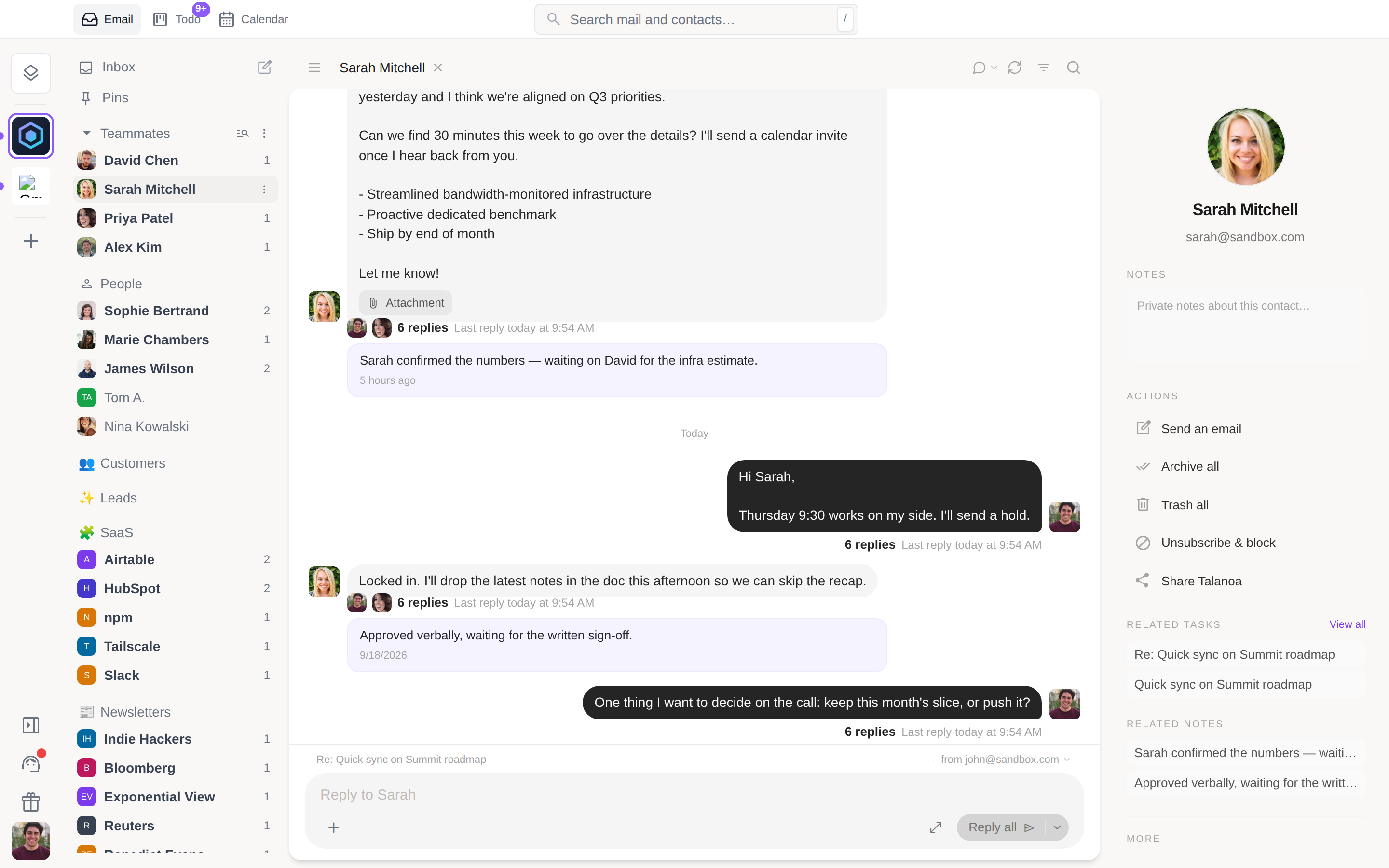
So in v0.11.0 we rebuilt reading around the conversation, not the message. Open a thread you’ve replied to and you get a stream of bubbles. Each one shows only what that message added. Quoted history, signatures, footers, “On Monday, John wrote:” — gone. Long messages fold behind See more. Images sit inside the bubble, attachments under it, and dates appear once, as separators.
The stream is anchored at the bottom: oldest at the top, newest last, older pages loading as you scroll back. A new message slides in where your eyes already are. I gave it a week before deciding whether it was better. I couldn’t go back after two days.
There’s a reply box under the conversation. Type, hit Enter, and your message appears as a bubble right away — attachments included — with a small ring that drains over six seconds. Click the ring and the text is back in the box, unsent.
Recipients come from the thread. Two people, and you reply to the person. A group, and you reply to everyone, with a Reply only switch when you want it private. If you need a subject, a Bcc or a template, the full composer is one click away and everything you typed comes with you. Cmd+Enter and Ctrl+Enter still send.
It works per sender, too. Click a person in the sidebar and you get everything you’ve ever exchanged with them as one continuous conversation, across every subject line, reply box at the bottom. This is the view I now spend most of my day in. A colleague is a relationship, not a list of subjects.
Bubbles throw away information. Quoted history isn’t always noise — sometimes it’s the only record of what someone agreed to in message three. And a lot of mail isn’t a conversation at all: a receipt, a newsletter, a Stripe alert has no back-and-forth to show.
So two rules. Bubbles only appear on threads you’ve actually written back to; everything else keeps the full-width cards with the newest one expanded. And the classic view is one toggle away in the header, remembered per account. If you want the quoted trail, it’s still there, unchanged.
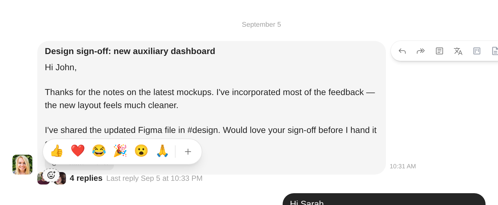
Hover a bubble and a small 😊 appears: one click for 👍 ❤️ 😂 🎉 😮 🙏, or the full picker. The reaction shows up as a pill under the message.
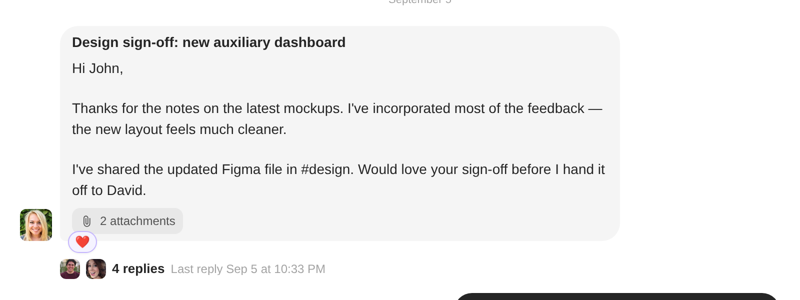
Underneath, it’s real email — a tiny message in the format Gmail understands. Gmail recipients see the emoji natively. Everyone else gets a one-line ”🙂 John reacted” with your message quoted, which is uglier than I’d like and still better than a full “thanks!” landing in their inbox. Reactions you receive arrive as pills, not unread mail, and never touch your inbox count.
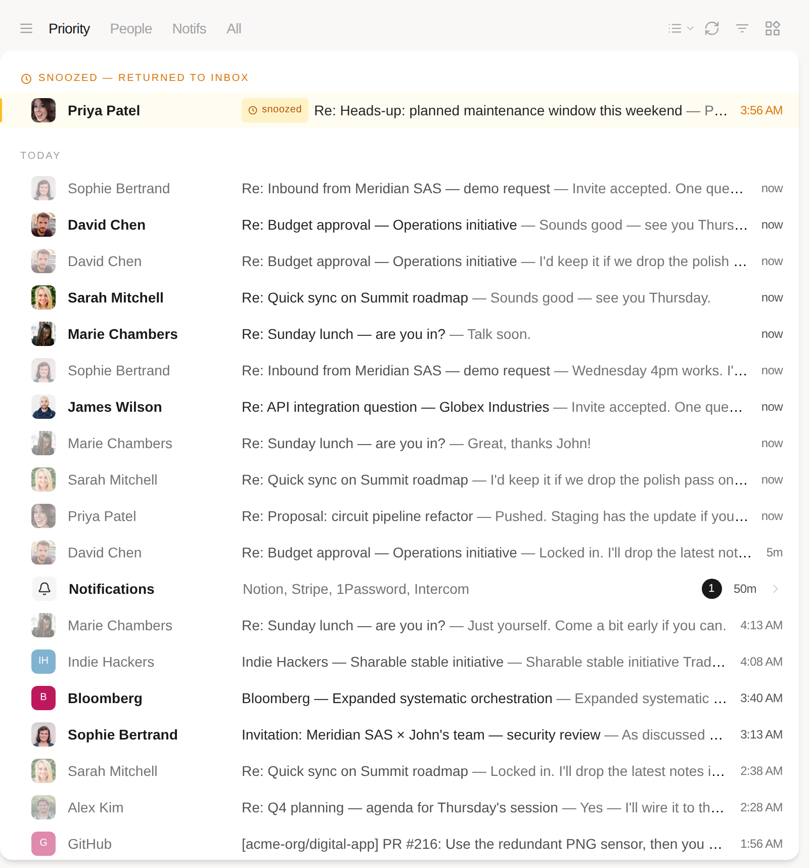
There’s a new first tab next to People, Notifs and All. Priority shows your inbox without the notifications, and teammates always stay in it.
The mail it leaves out isn’t hidden, it’s folded. A single Notifications row sits in the timeline at the time of the newest one, listing who sent them and how many are unread. Click it to open the Notifs tab. Whichever tab you pick is remembered per account.
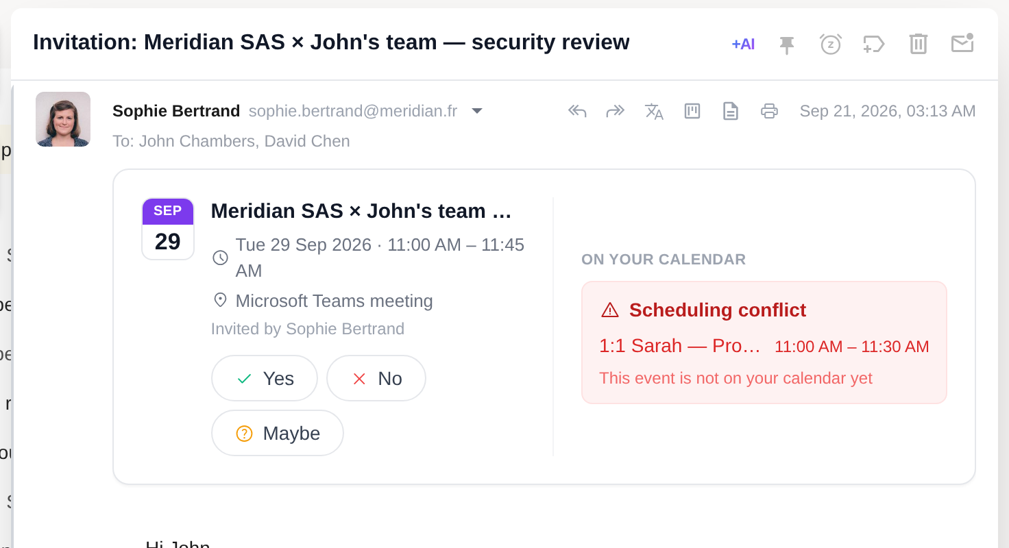
Until now Talanoa only understood Google Calendar invitations. An invite from Outlook, Exchange or Apple Calendar was a paperclip you had to open somewhere else.
Now any .ics becomes a banner: the event, who invited you, Yes / No / Maybe, and your answer goes back as a proper calendar response. If it’s a published event with nobody to answer, you get Add to calendar instead. The banner also checks the slot against your calendar and warns you when something’s already there.
The mobile app already reads mail this way — reactions and push notifications for new mail land in its next TestFlight build. If you want in: Settings → Devices → “I want to be a beta tester.”
Update, open the longest thread you have, and tell me what you miss from the old view. That list is how the toggle stops being necessary.
— John
Try Talanoa
Why spend hours managing your inbox when you can focus on what matters?
Get started free